Case study evaluation

From this case study I learnt a huge amount and found it really beneficial to my art and understanding. The most helpful thing I found through this case study was in fact the small Q&A I did with Erwin Madrid about his work and such. I found that his answers really helped me when working on the master studies that I did of his work as well as understanding the processes that he went through to get his work done.

I am really happy with how my understanding of his work and lighting has developed through doing this case study and I will keep practicing things he stated that he did, such as the drawing of the environment and I will look into doing drawing classes after university.

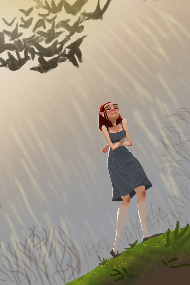
Even with all this I am still not happy with the case study and feel like there is still a lot more that I need to do for it. I feel I still need to study his works more and try to reproduce them not only in his style but also see what they would look like in my kind of style. I would also have liked to go on to do other images in his style to see what it would look like if he possibly had done them but I did not get a chance to.

My weakest point I think is still colours and I really need to work on getting them more vibrant and closer to the actual images so if I do continue this in my own time that is something I will focus on. In my own time I will be focusing a lot on colours and values but Erwin Madrid suggested that one of the best ways to do that was by actually using traditional materials so I think I shall need to buy more oils and go out and paint using them. Even though they will be really bad to start with I will get better (hopefully) the more I do it and the hope is that it will allow me to understand colour and values much better.

Masters study 2

The second digital case study that I did for of Erwin Madrid’s work was one of his environment images. The original has really rich colours and quite basic shapes that looked really interesting. I tried to replicate it the best I could and managed some what. Again the colours are off but not as off as they were in the first masters study that I did.

This is his piece:

This is my masters study of it. I did not manage to get the colour quite deep enough and it is lacking in the details that hes has but the issue is that some of those are from random brush strokes so recreating them is incredibly difficult.

Personal Project

The personal project I chose to do was focusing on environments and developing my ideas for it. Below are the different pieces that I created for this project.

As it was focused on environments I decided that not only did I want to create potentially real environments but I wanted to make some unique environments that could be from a different time or even planet. I found this really interesting and it allowed me to experiment with many different things such as the space ship in one of the images I did in photoshop.

As Erwin Madrid stated that he sometimes went straight into colour I decided that I would try it out. I really do not like doing this as I feel like it is just a bit too overwhelming and I could easily get off task and it looks awful. It was also really hard to keep the perspective without some sort of plan underneath.

For the following image I did some concepts for rocket ships that I had so that I could work out the idea of the rocket ship before painting it as I has a few in my head that I couldn’t decided between.

After doing these I really wanted to try out painting an environment in oil. Although it is really blocky I am fairly happy with how it turned out because I painted it with a limited palette to see if I could do it. Not the Zorn palette but a small selection of colours that I chose: Black, White, titanium blue, red ochre and cobalt yellow. From using these I discovered that you can actually get a lot of different shades really easily and I realised why I did like oils (for the blending) however I still really hate the drying time and if I had to pick one section that I am really not happy with it is the sky. The image I was using as reference had 3 key layers of colour, a pale-ish blue in the back, white clouds at the bottom near the mountains and then a darker cloud in the center/right near the top.

McQue 2 – Finally completed

After a long time off of it I finally went back to the second McQue study that we had to do so that I could complete it, and believe me, it was only because I had to. It is in no way in a state that I am happy with but for some reason this one is just really getting to me. It always had. I don’t know if it is the style that it is painted in or whether it is the odd perspectives of the bins and such. However, it is finished to a standard that I don’t like, but can accept.

I am fairly happy with the shapes of things however the colours are off and the details are the things I really struggled with (after I finally got the shapes down). It was really interesting to do this piece however and I feel I did kind of learn how the artist could have gone about it. It became clear that, as I had suspected, they most likely blocked out the shapes as usual and then went in with the other parts of the painting. It also appears that while in places they painted quite blocky in others they almost gradiented, such as with the wall and the light.